For the WordPress build
Elementor Pro build notes
How each section of the home and shop layouts maps to Elementor Pro + WooCommerce widgets, plus the few snippets that need Custom Code.
1 · Site settings
Global colours
Category accents (used on tags, filter chips and the category-card hover fill): Living #8A3A1E, Dining #6A2129, Bedroom #6B6A45, Workspace #5A3D29, Lighting #B88A3A. Store them as a term meta colour on product_cat (ACF colour field) so the Loop Item can read them dynamically.
Global fonts
| Role | Font | Size (desktop / mobile) | Notes |
|---|---|---|---|
| H1 hero | Cormorant Garamond 300 | clamp(46px, 6.6vw, 112px) | line-height .98, letter-spacing −0.015em |
| H2 section | Cormorant Garamond 300 | clamp(38px, 5vw, 77px) | Italic words use the Gold text colour |
| H3 / card title | Cormorant Garamond 500 | 23–46px | |
| Body | Jost 400 | 16px / 1.72 | Max width ≈ 62ch |
| Labels, nav, buttons | Jost 500 uppercase | 10–11px | letter-spacing .2em |
Layout: content width 1440px, side padding clamp(20px, 5vw, 88px), section padding clamp(72px, 11vh, 150px). Square corners, 1px hairlines instead of shadows. Buttons are 52px tall.
2 · Home page
| Section | Elementor Pro widgets | Effect & how |
|---|---|---|
| Preloader | Custom Code (body start) | Logo SVG with gold liquid fill, handwritten script and split-curtain exit. Paste preloader.html + the GSAP snippet below. Shows once per session. |
| Header | Theme Builder › Header · Nav Menu · Menu Cart · Search | Transparent over hero, sticky with blur after 80px, hides on scroll down (Sticky + "Hide on scroll" in Motion Effects, or the 10-line JS below). |
| Hero | Container 100vh · Background Slideshow · Animated Headline · Buttons | Slideshow with Ken Burns ON, 7s per slide, transition fade 1.6s. Headline: Animated Headline › Rotating › "Blur". Chapter bars are an optional HTML widget. |
| Intro split | Container 2-col · Heading · Text Editor · Image ×2 · Counter | Images: Motion Effects › Vertical Scroll, speed 1 and −1 (opposite directions). |
| Shop by room | Loop Grid (source: Product categories) or 5 Containers | Hover: container background colour fills upward; add class cat and the CSS in site.css › "category rail". |
| New in | Loop Carousel (WooCommerce products, tag "new") | Custom Loop Item = product card below. Navigation arrows + progress bar pagination. |
| Cinematic band | Container 78vh · Background image (Parallax) · Heading · Button | Pointer spotlight is optional Custom JS (initBands in site.js). |
| Shop the look | Hotspot widget | One hotspot per product, tooltip = image + name + price + link. Trigger on click, "Soft beat" animation. |
| Made to measure | Nested Tabs (vertical) | Each tab: image + heading + text + Icon List with right-aligned values. |
| Materials | Loop Grid / Image Box ×6 | Entrance animation "Fade In Up" with 70ms stagger, image zoom on hover. |
| Promise row | Icon Box ×4 | Line icons in gold. |
| Testimonial | Testimonial / Blockquote on Ink container | Copy is placeholder. |
| CTA | Heading · Button ×2 · Icon List (inline) | WhatsApp button links to wa.me/971555961771. |
3 · Shop page (WooCommerce archive)
| Section | Elementor Pro widgets | Effect & how |
|---|---|---|
| Page hero | Theme Builder › Product Archive · Archive Title · Breadcrumbs | Background image with overlay; image settles from 108% → 100% (CSS keyframe settle). |
| Room bar | Taxonomy Filter (linked to the Loop Grid) | Sticky (Motion Effects › Sticky top, offset = header height). Coloured square per category via term colour. |
| Filters | WooCommerce attribute filters, or Elementor's Filter / JetSmartFilters | Attributes: pa_material, price range, stock status. Off-canvas drawer below 1100px (Off-Canvas widget). |
| Grid | Loop Grid · Custom Loop Item · Sort (Products ordering) | Insert the "Shop the room" editorial tile with Loop Grid › Alternate template (position 5, span 2 columns). |
| Product card | Loop Item: Featured Image · Product Title · Price · Add to Cart · Badge (product tag) · Wishlist (YITH/TI) | Hover: image scale 1.045 (1.2s), action bar slides up from the image bottom (CSS .pcard__actions). |
| Quick view | Popup Builder (trigger: click on [data-qv]) + WooCommerce widgets | Or a quick-view plugin; the layout is image left, summary right, accordions for Dimensions / Materials / Lead time. |
| Side cart | Menu Cart › Side cart | Add the free-delivery progress bar (threshold AED 5,000 in the sample). |
| Bespoke band | Container 2-col on Ink | Gold primary button. |
4 · Custom code
Elementor › Custom Code. Load once, site-wide, at the end of <body>:
<script src="vendor/gsap.min.js"></script>
<script src="vendor/ScrollTrigger.min.js"></script>
<script src="https://unpkg.com/lenis@1.1.20/dist/lenis.min.js"></script>
<script src="/wp-content/themes/zk-child/js/site.js"></script>
Head (before paint), so motion never flickers and is skipped for reduced-motion users:
<script>(function(r){if(!matchMedia('(prefers-reduced-motion: reduce)').matches){
  r.classList.add('has-motion');
  setTimeout(function(){ if(!window.__siteMotion) r.classList.remove('has-motion') }, 6000);
}})(document.documentElement)</script>
CSS classes to add in the Advanced tab so site.css styles them: eyebrow (bracket label), h-lg, pcard, cat, band, rvi (image cover-lift reveal), attribute data-split="words" on headings (word-by-word rise), data-speed="0.12" for parallax.
The preloader is self-contained: one inline SVG of the logo (paths in LOGO_DEFS), CSS under "preloader" and the initPreloader function. It waits for window.load before reaching 100, and only plays the full animation once per browser session.
5 · Assets
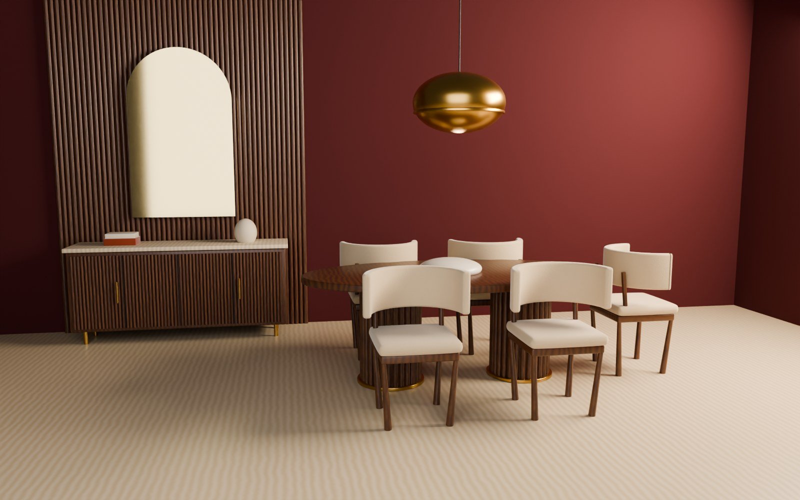
- Product and room images are sample 3D renders made for this layout; replace with real product photography (4:5 for products, 16:10 for rooms) in WooCommerce.
- Logo vectorised from the current site logo into three paths (monogram, script, tagline) so each can animate separately.
- Fonts: Cormorant Garamond and Jost, self-hosted as WOFF2 in
/fonts. - All prices, product names, descriptions and the testimonial are placeholders for approval.